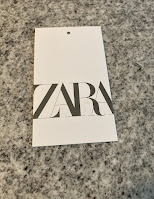
Today we have a hangtag from clothing brand Zara. The tag is a rectangle in white stock. The front contains the ZARA wordmark in its usual slightly stylized presentation. The mark is consistently displayed across most of Zara's branding - it looks nice here in a clean and direct presentation.

overwhelming and difficult to locate the information you are interested in.

There is a FSC mark, a recycle mark, a QR code, "size" written in 6 languages, and then the sizes written in numbers 4 times... Another bar code, a UPC landing zone, and www.name.com address...
Where to even start? The front is nice - its clean, sets a clear tone, and expresses itself. It doesn't stand out in this world, but it also isn't poor by any means. The reverse is awful, both for its crowding and inefficient design. There are two machine readable bar codes on the same tag. There are two small sustainability logos, neither of which is particularly readable to a human. There are multiple presentations of the sizing, and worst of all, they are written in arabic numerals. There is nothing wrong with writing things in multiple languages, but the "24" on "24 months" should not need to appear 3 times.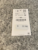
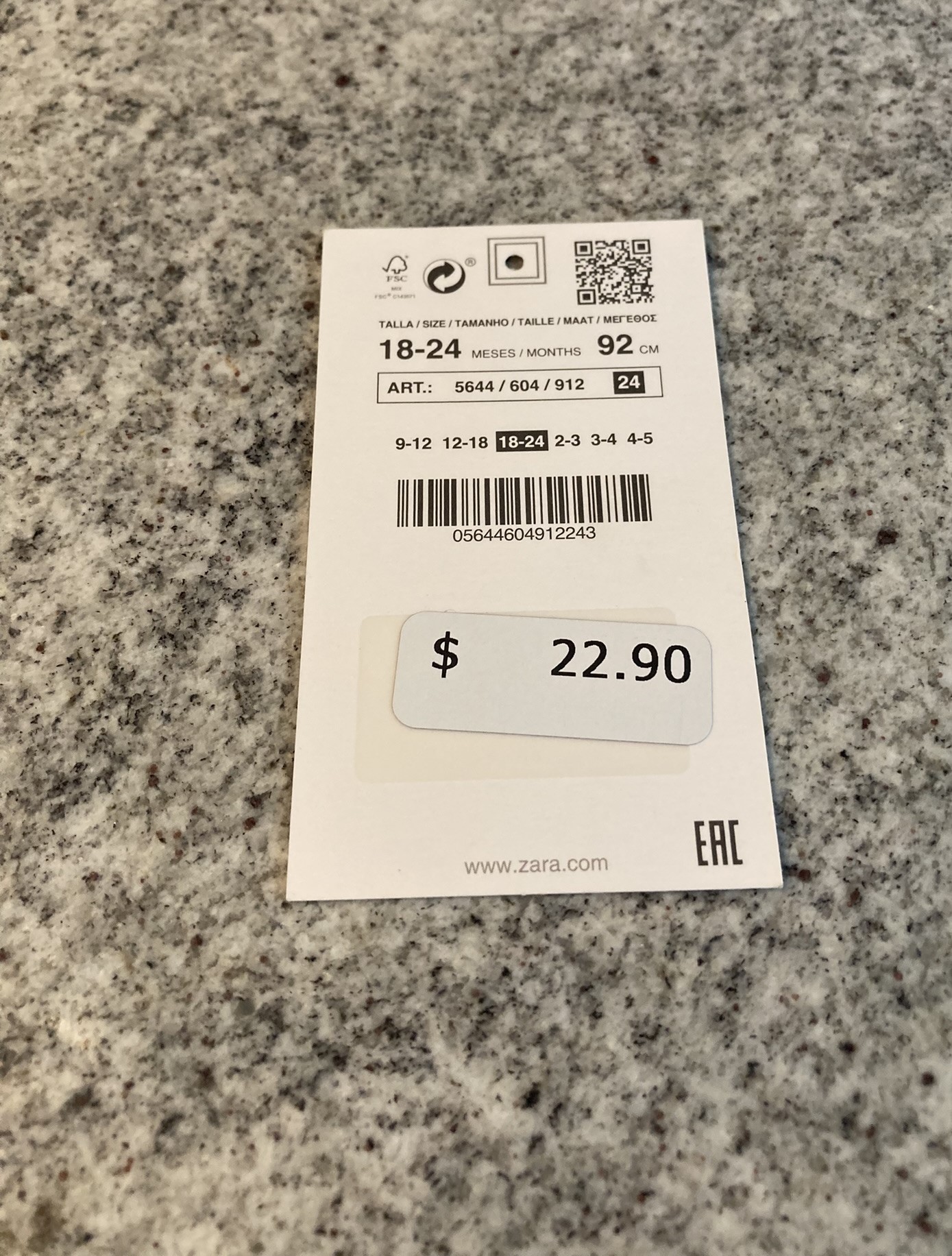

There are two small interesting details on the reverse. The first is that there is a machine readable target for the whole where the plastic tag goes, and the second is that the UPC Landing Zone has a clear sticker, presumably to make it easier for a machine to target.
This tag is a disaster, and not becoming of a pseudo luxury brand.
No comments:
Post a Comment