Friday, May 3, 2024

Hang Tag Review #48 - Sam Edelman

 This Hang Tag is from shoe brand Sam Edelman. The top hang tag is a solid lime green with the Sam Edelman cursive wordmark in black. The reverse is the same. The top hang tag also has a very nice metal grommet in solid black.

There is a second hang tag attached to the back, which is made of a semi-transparent plastic with the Sam Edelman wordmark printed on one side. On the reverse there is a price tag which is relatively straightforward. The second hang tag does not have the metal grommet.

This is a fantastic hang tag. The top tag in the bold lime green with the simple black wordmark is well executed. It calls to mind Nike's use of electric yellow at the Olympics - it is bright, easily recognizable, and stands out, but the simplicity of the design keeps it from reading cheap. A quick review of the Sam Edelman website demonstrates that the green is a current style choice and used throughout. The metal grommet is also beautiful - it adds a touch of class to the neon.

The second tag is very fun as well - it is made of a cheap feeling plastic, but interestingly it keeps the main tag clean by providing a space for the price tag to be affixed. It also has the very cool effect of showing the circuitry for the anti-theft elements of the price tag, as they show through the semi-transparent second hang tag.

The consistency among the trademarks is solid here as well - the same script wordmark appears in all instances, which keeps things memorable and clean. Although not normally something this blog covers, the string attachment is high quality. It is made of thick thread and there is a plastic piece with a version of the script logo as a monogram.

All in all an excellent hang tag on all fronts.


Tuesday, April 30, 2024

Hang Tag Review #47 - Ricrac & Ruffles

 Today we have a hang tag from children's clothing brand Ricrac and Ruffles. This tag is identical on both sides and features heavy use of a deep pink color. The wordmark is made up of several different fonts and styles, and sits inside a white border with additional features. The full www dot name dot com sits on the bottom in plain white text.

The wordmark is clearly the most interesting part of this hang tag. It features the name with an interlocking R monogram, the "ricrac" in a relatively standard font, but the "ruffles" is done in unconnected cursive. The ampersand also appears to be in an entirely different font from all the other letters (or possibly the same as the Rs, tough to tell). 

It is really hard to understand the choices made, but to some extent they do fit with the overall vibe - there is a lot of frilly/lacey style going on here, which suits the luxury children's brand theme. This is the type of hang tag that you'd expect to find on the "good clothes" your grandmother wore as a child.

All this said, the rest of the tag is empty, outside of the full web address. Why would one choose to go somewhat simple and clean with the overall design, but then feel compelled to add in a full web address that is simply the same name as the brand?

Overall, not a great example of design.


Wednesday, July 6, 2022

Hang Tag Review #46 - Cosmic Blue Love

This is a fun one - our first broken link!


The hangtag from Cosmic Blue Love has an eye catching front. It is a creme card in a vertical rectangular shape, with gold starbursts throughout. It has Cosmic Blue Love in dark script, and hangs on a thick waxed cord.


The reverse is more or less empty - it has a sticker with the garment details, a www.name.com address, and a hashtag of #EYESONTHESTARS.


The front is solid here - the design is eye catching and communicates the mood clearly. It doesn't overdo it, but it also doesn't drown in its own minimalism. Well done!


The reverse is strong as well! Again, a lot of empty space, but that is always acceptable. While TheHangTagBlog normally eschews the web addresses, Cosmic Blue Love is a subbrand or housebrand of clothing delivery service StitchFix, so giving clear directions helps it keep from getting lost amidst the other search results. The hashtag inclusion makes sense, especially for an online only brand. It is worth noting that the web address doesn't quite bring a broken link, but it does lead to a static "coming soon" landing page! Ouch!


Since this is an online only brand, they have smartly decided to forgo things like price and barcodes in favor of a more descriptive UPC giving style and wash details. This shows a real comfort with thoughtful applications for a specific business model. Excellent overall, a truly great contender.

Tuesday, July 5, 2022

Hangtag Extra - Zara Add On tags

Here is a small collection of add ons with Zara hangtags. Earlier, there was a tough review of the main Zara hangtag, mostly for the reverse side which was covered with symbols and repeated designations that might have been useful to computers, but were certainly not helpful to people. It turns out, Zara also stacks these additional squares onto many of their garments.


Here are four - J O I N L I F E, Regular, 100% Linen, and Garment Dye. It is easy to guess that Regular is a fit, and 100% Linen is a fabric, but Garment Dye and Join Life are less clear. The reverse of each has the same two sustainability logos from the main tag...

Confusing are the multiple fonts, weights, kerning, and colors among these add on tags...


Friday, July 1, 2022

Hang Tag Review #45 - Zara

Today we have a hangtag from clothing brand Zara. The tag is a rectangle in white stock. The front contains the ZARA wordmark in its usual slightly stylized presentation. The mark is consistently displayed across most of Zara's branding - it looks nice here in a clean and direct presentation.

The reverse is a mess. Words, logos, barcodes and other bric a brac abound. It is immediately
overwhelming and difficult to locate the information you are interested in.


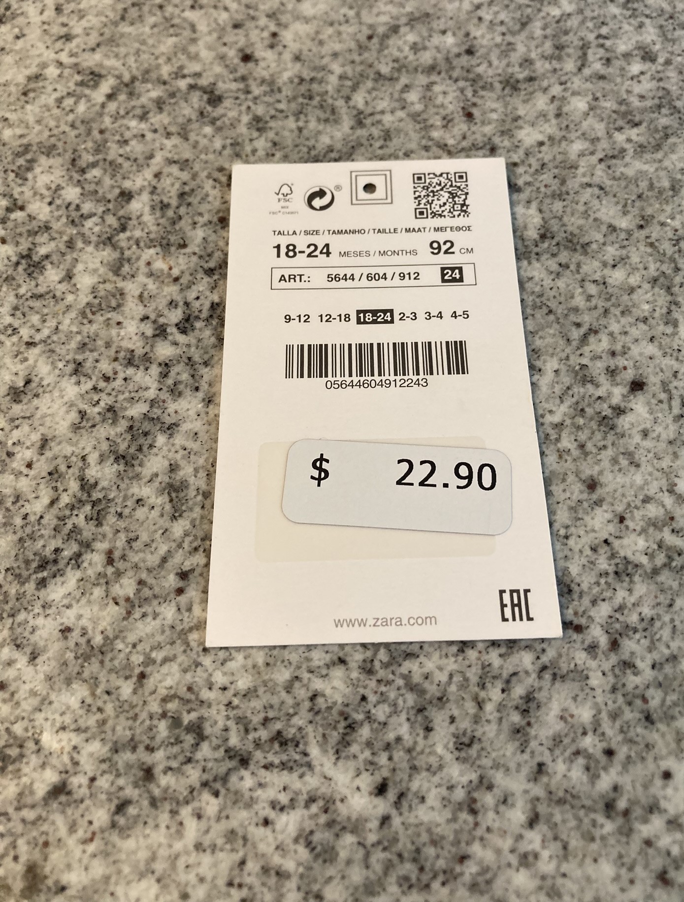
There is a FSC mark, a recycle mark, a QR code, "size" written in 6 languages, and then the sizes written in numbers 4 times... Another bar code, a UPC landing zone, and www.name.com address...

Where to even start? The front is nice - its clean, sets a clear tone, and expresses itself. It doesn't stand out in this world, but it also isn't poor by any means. The reverse is awful, both for its crowding and inefficient design. There are two machine readable bar codes on the same tag. There are two small sustainability logos, neither of which is particularly readable to a human. There are multiple presentations of the sizing, and worst of all, they are written in arabic numerals. There is nothing wrong with writing things in multiple languages, but the "24" on "24 months" should not need to appear 3 times.


There are two small interesting details on the reverse. The first is that there is a machine readable target for the whole where the plastic tag goes, and the second is that the UPC Landing Zone has a clear sticker, presumably to make it easier for a machine to target.

This tag is a disaster, and not becoming of a pseudo luxury brand.

Wednesday, June 29, 2022

Hang Tag Review #44 - Sweet Honey Clothing

This is a hangtag set from children's clothing brand SweetHoney. This is clearly a nice hangtag with luxurious materials, including two thick cards with metal grommets, a length of pink ribbon, and a safety pin attachment.
The top hangtag is a small square in cream with the name SweetHoney in a delicate gold ink script. The script color matches the metal grommet, although the treatment on the wordmark is much more "gold" whereas the grommet reads "functional metal."

The second tag is an oval in a very delicate blue. In fact, the blue is so soft it is hard to detect except in the best lighting. It has the cameo style mark with the name, YoungEST, and the interesting flower design. The CELEBRATE YOUR EVERYDAY tagline is present at the bottom. The entire printing on the front is in the same gold ink, although here there is a sans serif block font with all caps. The reverse continues the CELEBRATE YOUR EVERYDAY tagline at the bottom, but the top has printed care instructions. Interestingly, the care instructions are not printed in the gold ink, but instead just simple dark text. There is also a name dot com.


This is overall a nice a tag set, with high quality materials. The safety pin closure is nice - the plastic tags (perkets) are awful in all aspects. The ribbon is just ok - it looks nicer than just using the plastic tag, but it isn't special.

The second tag is the real star here - a pleasing oval shape and a clean front are well appreciated. The reverse is fascinating - not just care instructions, but care instructions with household tips (adding salt). The only misses are the repeat of the tag line, which is unnecessary as it is also on the front, and the name dot com, which crowds the text but adds nothing.

Overall, a highly rated design.


Friday, September 11, 2020

Hang Tag Review #43 - Ruffled Ribbon Co


Today we have an excellent hangtag from the Ruffled Ribbon Co. The tag features three pieces and a twine cord tie. The main paper is a white square on solid cardstock featuring the logo in a stained ink grey along with what would otherwise be a name.com if not for the etsy domain. 


The second tag is the washing instructions, which oddly enough are on the hangtag instead of the clothing itself. The washing instructions are mostly printed in typewriter.


The third piece is a small pennant with a floral design that attaches on the top of the stack.

This is a high quality tag, doubly so for being an etsy store. The three pieces, the thick cardstock, and the twine all are quality materials that indicate a certain level of care and planning. It is clear that whomever came up with this wanted to portray a very specific ideal with the hangtag. The front pennant is a solid little touch, and adds a bit of color to an otherwise monotone design. That said, it does get lost in the twine and isn't as impactful as it could be.


The main logo is nice indeed, although it does come across as slightly "current" in the worst, instagram friendly ways. The circle is either a coffee stain or a sweat ring, neither of which imply care or cleanliness. The presentation of the name itself, however, is much better The changing fonts are acceptable here, as they form a family and look nice next to each other. The script of "The" is maybe a little hard to read, but otherwise, it makes a strong statement. The URL is both good and bad - if you need the etsy piece, its important to add, but the use of "co" prior to the ".com" is a poor choice in terms of both computer readability as well as human impact. People will be wondering "Was that a co or just part of the .com?"


The inclusion of the care instructions on the hangtag is baffling. First, this may not meet legal requirements in certain jurisdictions, and second, it is useless to anyone who wants to actually care for the clothes. Aside from practical consideration, the design is cringey - a best guess is the all lowercase typewriter print is supposed to convey a farmhouse recipe card, but the odd script of "instructions" just destroys the entire look. Why is this in script? The same goes for the irregular spacing and capitalization of the rest of the directions. Is there any rhyme or reason to it, or is it just random? To top it all off, the directions themselves could be written more clearly.

This is a hangtag trying to do too much and getting it all wrong. Instead of just providing a hangtag, we have a mash-up of ideas that would fit well on a pinterest board, but fail on this hang tag.


Wednesday, May 30, 2018

Hang Tag Review #42 - Nike Dry 2 Piece Set

This hangtag is from Nike Dry and is a three parter (despite being a "2 piece set"). The top tag is a small square that is clearly an add on over the top, and most likely added to lots of garments sold as sets. It has the swoosh, and then says "2 Piece Set" in 4 languages. The reverse has the UPC space indicator, open on this one. Let's start calling them UPC Landing Zones, shall we?

The next two tags are the ones that actually have the goods on them, and are larger rectangles. The first is more or less blank, with only the Nike Swoosh and what looks like a sublimated thumb print design. The reverse is similarly plan, a matte black with handling numbers at the top and a couple logos at the bottom. It also contains a very bizarre Name.com, made even more so considering Nike is one of the most famous brands on the planet.

The third tag is the features tag - defining Nike Dry and giving the basics of the technology. Oddly enough, its referred to as "Dry" and "Nike Dry" but there is also usage of "DRI-FIT" technology. This tag as a sublimated cross-hatch design. The reverse has the same description of Nike Dry but in French this time. It also has a UPC tag and the same assortment of trademarks as the previous.

Overall, this tag is interesting because it demonstrates some of the failings of the optimization of global brands. For example it has three different pieces that are somewhat contradictory - since this specimen has the bar code stickers still attached, it is clear that these were two separate items that were stuck together and sold as a set. Also, the design changes - both have very difficult to see sublimations, but one is a finger print style wave, the other is a cross hatch. Why use two different designs across what is essentially a single product, unless someone got their lines crossed.

I'll also mark this one down for Faux French, if for no other reason than because the first hang tag has 4 languages, but oddly enough the Feature Tag only has English and French. The choice only makes sense if you are impressed by having French text on your apparel.

Enough with the bad though - I love the weight and texture to these (which I know comes through great over the internet). They are heavy and have a nice almost rubbery texture to them. Also, the top 2 piece set tag is has probably my favorite UPC Landing Zone of any tag I have looked at. Its tiny with a tiny box, clearly labeled UPC. I love it.

Friday, April 20, 2018

HangTag Review #41 - Ok!e Dokie

Today we have a children's hang tag from the JC Penny house brand "Ok!e Dokie." I'll be calling it Okie Dokie from here on out, because I'm not a masochist and like to type actual words, but the play on the upside down "i" into an exclamation point is actually somewhat well done. It hits the kids theme (because we all know kids and backwards letters go together, a la Toys "R" Us) and uses standard punctuation. I noticed that the word mark is listed only with a TM, so I checked the register and found a couple that have existed for some time, but all seem to either be dead or cancelled. I'd love to get the story, but in any case, there is no active registration for this tag.

The front is no nonsense - a solid navy with the name and the size, plus a tear-away at the bottom. The tear away, interestingly enough, is both a gift receipt and a multiple piece indicator. I haven't noticed this yet, but it works - it stands to reason that if you aren't going to sell them as a set, you probably won't use the manufacturer's suggested price either, so might as well remove both.

The reverse is typical discount house brand fare - 100% factual information in a machine readable format. The reverse's odd blue color sure is rough on the eyes, but the layout of the information is commendable. There is a lot packed onto the tag, but it isn't overwhelming. It may not be beautiful, but functional it is.

It is worth pointing out the color of the one tag, "Living Coral." Say what you want about the health of our earth and the role each of us plays in being aware of our actions and their impact on it, I would never think to see it called out on a discount, mass market, clothing hang tag. I guess "Dead Coral" or "Bleached Coral" don't have the same appeal, but what, really, is living color? The color "coral" is generally understood to be a variation of orange, but if you use the distinction "Living" it must be a reference to the actual plant/animal/rock that lives in ocean reefs. As such, the color of such life ranges from blues, to yellows, to reds, to browns, to greens, and, I'm sure, the eponymous orange.

In any case, these tags are certainly not high on my list. The trademark mystery is somewhat exciting, but overall, these are function above all else.

Saturday, December 10, 2016

Hang Tag Gore - Levi's Denizen

Sometimes you run across something so awful it doesn't even warrant a review - this is one of those times. Although Levi's is a premium brand in most of the world, in its home country of the US of A, it somehow is one of the most mass market name brands in existence. I'm fairly certain I stumbled across this in a Walmart, and although I only present this one example here, there were countless variations for different denim products.

What's wrong you ask? For starters, why is everything shouting at me in bold face all caps text? Maybe it is because the product is so bland and generic it would be too easy to overlook. There is a way to do text heavy design, but this certainly isn't it. I mean just look at the feature list - "Classic and comfortable for all occasions." That's fight, these can be your fancy jeans as well as your comfy jeans as well as your work jeans, all in one pair! I don't know if this is an officially adopted maxim, but if your clothing gives you permission to wear it either up or down, it probably isn't acceptable to do either.

And what is up with Levi's destroying the registered trademark symbol? I first saw it on the Denizen line name, and figured it was a misprint, but then I noticed it was done the same on the Levi's wordmark! Holy hell, what are they thinking? Is it supposed to be edgy?

I'll also call attention to the model - first, nothing says "Dad jeans" like that guy with his button down sleeves rolled up but tucked into his non-belted jeans. It is also a bit of a Photoshop disaster - unless he is a Gears of War character there is something seriously wrong with his over-sized feet, and his legs are about 90% of his total body.

And to top it all off, this is the Hang Tag Blog, and while I sometimes drift into related fields, this is not a hang tag. It is instead affixed directly the pants with plastic rivets, meaning you either need careful work with scissors or you end up fraying the fabric before you put them on. I'll also ignore the ham fisted "Denizen" name, the use of rivets next to the word durable, or the fact that Levi's surface the "236" name so prominently. If I had to pick something I liked about this, it would be the way the "236 Regular Fit" is set off from the rest of the tag - the red box with both upper and lower margin lines is classic design and well executed. I like the way it isn't constrained by the margin of the rest of the text and spills into the product image.

Levi's, I don't know who thought this up, but please, no more.

Wednesday, November 16, 2016

The HangTag Blog Awards: 2 in 10


Hello and welcome to the HangTagBlog Awards! This will be our second major awards presentation! In case you are unfamiliar, the award scheme is here. This will be a second 2 in 10 award, covering hangtags 21 through 40.

Although the posting schedule remains slow and somewhat varied, these entries are all at least from 2016, so a major improvement from the previous go around. Let's see who the nominees are this time:

#31 - Stoosh
#32 - Carter's Little Collections "Christmas Tree"
#33 - Carter's Little Collections "Wolf"
#34 - Harper
#35 - Michael Kors "Jet Set"
#36 - Joe B by Joe Benbasset
#37 - Summer Oasis
#38 - Cat and Jack
#39 - Star Wars "Union Suit"
#40 - Old Navy "Active"

Wow - when I first started looking over this post, I was worried that I would struggle to find any to award. When I compiled this list, though, I realized that the opposite is true. What a collection!

I ooh'd and aah'd over the super cute designs of the Carter's pair, especially in light of the fact that typically Carter's has terribly designed hang tags. I also praised the Harper tag for clean and simple design that spoke volumes about the product and set the tone perfectly. Summer Oasis scored points for being surprisingly coherent and complicated, and was likewise a clean and focused design. On top of that, the Cat and Jack set really caught my eye, and looked much more expensive than they should have.

Ultimately, both Cat and Jack and Summer Oasis are going to be the winners here. If you put the baby items next to each other, Carter's is relying heavily on one cute design element on an otherwise bland tag, while Cat and Jack is a really great, all encompassing design. Summer Oasis also bumps up next to Harper in a really direct way, and for my money the Harper hang tag is solid but can't quite hang with this crowd. Summer Oasis meanwhile, has a bright, intricate design that matches with the clothing, and also contained the stylish front back wrap around.

The Honorable Mention this 2 in 10 is definitely the Stoosh tag. One of my truest inspirations is Paul Lukas over at Uni-Watch, and his side project of Groom-it, and this hang tag contained a very nice implementation of the ubiquitous metal ring.

Monday, November 14, 2016

HangTag Review #40 - Old Navy "Active" HangTag

This hang tag is from discount brand Old Navy, and specifically their "Active" line. The tag is nearly black, with a yellow double line logo, and then OLD NAVY ACTIVE displayed beneath. There is also a half banner that says "Go Dry" and a short line about moisture wicking in two languages. The reverse is pretty spartan, with another product description of "BREATHABILITY" followed by a few words explaining, again in two languages. The rest is just the price sticker.

Well, Old Navy is a discount brand, so the hang tag expectation is a little lower, but this one is pretty rough. The paper is cheap, and while I think the tag is supposed to be black, its actually just a washed out sort of black-ish color. I'm also really not a fan of the completely forgettable and generic logo - I'm sure a design consultant can point to the fact that it looks like a runner with their arms raised in victory (as the Olympics does from time to time). I also wish that someone would have made an executive decision to not put "ACTIVE" in italics. We get it, italics convey motion, great.

I'm also going to hit this one with the Faux-French designation. First of all, I'm not entirely sure that those translations are anything more than machine translations (or bottom dollar service). I don't know French especially well but it looks suspect. Further, I'm not sure that Old Navy's (itself a Gap sub-brand) Active sub-brand really needs to have an air of French design or taste. We know you took a look at the latest Nike designs and reproduced them as cheaply as possible, we don't need french text.


This hangtag is about as generic as they come, and a miss in my book.

Saturday, November 5, 2016

HangTag Review #39 - Star Wars Union Suit

Disney's acquisition of the Star Wars franchise has turned up the licensing machine full force, and in addition to a steady stream of new movies we are being treated to a near constant barrage of merchandise. This hang tag comes from one such item - a Chewbacca Union Suit.

First and foremost, it should be explained that a Union Suit is merely a descriptive term for a single undergarment that combines a shirt and a pair of pants. Think long johns or those pajamas that are in old cartoons with a snap up button panel. Do not think to search them on Google images without safe search on.

This one is designed to look like the character Chewbacca from Star Wars. Presumably one part Halloween costume, one party novelty item, this is a lowest common denominator item.

The front of the hang tag is straightforward - the top portion is a picture of Chewbacca pointing his signature crossbow at the camera. The bottom has the Star Wars wordmark in negative with the words UNION SUIT below and a red circle with an S and the label SMALL. This is really terrible in terms of hangtags. It does not seem terribly well through out and it fails to convey any real sense of design or effort.

The reverse is a tiny bit better. Instead of the photograph of the actual Chewbacca, there is an incredibly goofy illustration of a very doofy guy wearing the suit. Otherwise it is the same as the front.

I have a lot of problems with this tag. It is really low effort, all they did was put a picture on it with a brand wordmark and a descriptor. I like simplicity and clean designs, and this is simple but is not particularly clean. Simply throwing all your logos onto a card isn't design, its hitting a checklist.

I also think you need to either lean heavy into the illustration, or heavy into the actual movie license, but you can't put both on the same tag.

It is almost as though they know that these will not be purchased by true fans (who will go upmarket) but instead by someone's distant relative who is a bit out of touch but will say "Oh, didn't he used to love those space movies?" If anything, I imagine most of these end up as gag gifts, purchased for drinking-holiday parties or as a good natured goof for a spouse.

I had some excitement about a Disney branded tag, but so far this and the children's one I reviewed here have both fallen incredibly flat.


Sunday, October 9, 2016

HangTag Review #38 - Cat and Jack Double Set

Check out this nice find in the children's section for Cat and Jack. The main front tag is a pale blue (perhaps a "Baby Blue?") with the Cat and Jack script wordmark in red. The reverse of that tag has the same color scheme in stripes, along with the retailer information.

The feature tag is an eggshell color with the words "MADE FOR PLAYING, DRESSING UP & ADVENTURING." in the same red as the main wordmark. Underneath is says "SKINNY" which I believe is a fit designation. This tag has the pale blue on the reverse with more retailer information.
The main tag, however, has a small detail that I find really great - the gift receipt isn't cut straight across, but instead in triangle fringe. There are plenty of hang tags in unique shapes, but this one is so unexpected that it stands out. The gift receipt tear away is theoretically functional, as ideally this piece is removed before giving the item as a gift. In this case, that piece would leave simply a straight edge (or a sloppy perforation). The design is nice too. When the tag is hung vertically, it looks like a banner. The reverse colors also convey a real sense of Dr. Suess whimsy. All in all, this is a quality tag.


The second tag is nice as well. I'm referring to it as a feature tag but that isn't entirely accurate, as it refers to the second item in a set. The color scheme is excellent, if a little bit predictable. The "playing, dressing up and adventuring" word choice is simple and obvious, but the layout is nice. I'm surprisingly impressed with using the waves as a horizontal rule, as it plays into the "adventure" idea and lends the tag some cohesiveness.

I'm really against the idea of putting body size labels on clothing aimed at children, but I think the Skinny designation here really refers to the overall cut of the pants. Even then I think this is a miss for the design as its purely marketing. Toddler clothes are made as they are, "skinny" vs "relaxed" likely makes no appreciable difference. Thus, this word was placed to catch the eye of Mom while picking these out.

A quality effort and a solid example in my book.


Wednesday, July 6, 2016

Hang Tag Review #37 - Summer Oasis

I've previously written about Target's Xhiliration House Brand, but this one is a sub brand (or maybe a collection is what Target wants you to call it) of Xhiliration. It is on their website here. The front has the name of the collection and the year, flanked by colorful flowery designs. The reverse has the full pattern.

If it isn't clear already, I like this hang tag. A lot. The front is excellent, simple and clean. It very clearly states the collection name, and gives a date for reference. Adding the date adds a bit of exclusivity and rarity, which is enjoyable. It avoid becoming pretentious, however, by not adding a YoungEST or other silly 'classic' elements.

I also find the way the pattern wraps around to the front of the tag to be really nice. I like the colors and design, and the way it sits on the solid black is nice. One of my favorite parts, however, is the way the hang tag design so clearly complements the actual clothing patterns as well. If you review the Target website, you can see that the same pattern is used on this dress.


This all should be taken with a bit of a caveat, however, as the only reason this tag looks so clean is because it is on the same hanger as the house brand tag. If it were by itself, it would almost certainly  add in some extra information that would clutter and take away from the overall appearance. Still, this is a great find and surprise for a Target brand hang tag.